CSS Grid Layout is a powerful tool for creating complex, responsive web layouts. With its flexible grid system, you can easily arrange and position elements on a web page, allowing for a more dynamic and visually appealing design. In this comprehensive guide, we will explore the various features and techniques of CSS Grid Layout, and provide you with the knowledge and skills to master this essential web development tool.
Understanding the Grid System
Before diving into the features and techniques of CSS Grid Layout, it is important to understand the basic concept of the grid system. At its core, CSS Grid Layout is based on a two-dimensional grid structure that consists of rows and columns. This grid acts as a container for all the elements on a web page, and allows you to define how these elements should be positioned and sized within the grid.
The grid system in CSS Grid Layout is highly flexible and customizable. You have full control over the number of rows and columns in the grid, as well as their sizes and positions. This means that you can create layouts that adapt to different screen sizes and orientations, making your website responsive and user-friendly.
One of the key advantages of CSS Grid Layout is its ability to handle both fixed and flexible layouts. With fixed layouts, you can specify the exact size of each row and column in the grid, ensuring that your design remains consistent across different devices. On the other hand, flexible layouts allow the grid to automatically adjust the size of its rows and columns based on the content within them, making it easier to create fluid and adaptable designs.
In addition to its flexibility, CSS Grid Layout also offers powerful positioning capabilities. You can easily control the placement of elements within the grid using properties like grid-row, grid-column, and grid-area. These properties allow you to specify the starting and ending positions of an element in the grid, as well as its span across multiple rows or columns.
Furthermore, CSS Grid Layout provides a wide range of alignment options that allow you to fine-tune the positioning of elements within the grid. You can align elements horizontally and vertically, as well as distribute them evenly across the grid using properties like justify-items, align-items, justify-content, and align-content.
Overall, CSS Grid Layout is a powerful and versatile tool that can greatly enhance your web design skills. By understanding the grid system and its various features, you will be able to create stunning and responsive layouts that are both visually appealing and user-friendly.
Understanding CSS Grid Layout
CSS Grid Layout is a two-dimensional grid system that allows you to create complex layouts with rows and columns. Unlike traditional CSS frameworks, which rely on predefined grids, CSS Grid Layout gives you more control over the placement and sizing of elements on a web page.
With CSS Grid Layout, you can define both the structure and the design of a web page. You can specify the number of rows and columns, set their sizes, and determine the placement of elements within the grid. This level of control makes CSS Grid Layout an ideal choice for creating responsive designs that adapt to different screen sizes and devices.
One of the key features of CSS Grid Layout is its ability to handle both fixed and flexible layouts. You can define fixed sizes for rows and columns, which means that they will always have a specific width or height, regardless of the content within them. This is particularly useful when you want to create a consistent layout across different pages or devices.
On the other hand, CSS Grid Layout also allows you to create flexible layouts, where the size of rows and columns can adjust based on the content within them. This is achieved by using the “fr” unit, which stands for “fraction”. By specifying the size of a row or column as a fraction of the available space, you can create layouts that automatically adjust to fit different screen sizes.
In addition to defining the size of rows and columns, CSS Grid Layout also provides powerful tools for controlling the placement of elements within the grid. You can specify the starting and ending positions of elements, as well as their alignment within a cell. This gives you the ability to create intricate designs with precise control over the positioning of each element.
Another advantage of CSS Grid Layout is its ability to handle both horizontal and vertical layouts. While traditional CSS frameworks often focus on creating horizontal grids, CSS Grid Layout allows you to easily create both horizontal and vertical grids, or even a combination of the two. This flexibility gives you more options for designing unique and creative layouts.
Overall, CSS Grid Layout is a powerful tool for creating complex and responsive layouts on the web. Its ability to handle both fixed and flexible layouts, along with its advanced features for controlling placement and alignment, make it an essential part of modern web design. By mastering CSS Grid Layout, you can take your web design skills to the next level and create stunning layouts that work seamlessly across different devices and screen sizes.
Once you have defined the grid container, you can start adding grid items to it. Grid items are the elements that will be positioned within the grid. To add an element as a grid item, you simply need to apply the display: grid; property to it.
When adding grid items, you have the flexibility to specify their position within the grid using the grid-column and grid-row properties. These properties allow you to define the starting and ending positions of the grid items in terms of the grid lines.
For example, you can use the grid-column property to specify that a grid item should start at the first vertical grid line and end at the third vertical grid line, effectively spanning two columns. Similarly, you can use the grid-row property to specify the starting and ending positions of a grid item in terms of the horizontal grid lines.
In addition to specifying the position of grid items, you can also control their size within the grid. By default, grid items will automatically adjust their size to fit the available space within the grid. However, you can use the grid-template-columns and grid-template-rows properties to define specific sizes for the columns and rows, and the grid items will adjust accordingly.
Furthermore, CSS Grid Layout provides powerful features for responsive design. You can use media queries to define different grid layouts for different screen sizes, allowing your grid to adapt to different devices and viewport sizes.
In summary, CSS Grid Layout is a powerful tool for creating complex and flexible grid-based layouts. By defining a grid container and adding grid items to it, you can easily position and size elements within the grid, creating visually appealing and responsive designs.
Creating Grid Rows and Columns
One of the key features of CSS Grid Layout is its ability to create rows and columns with ease. You can specify the number and size of columns and rows using the grid-template-columns and grid-template-rows properties, respectively.
For example, to create a grid with three columns of equal width, you can use the following CSS:
grid-template-columns: repeat(3, 1fr);
This will create three columns, each with a width of one fraction of the available space. You can also specify the width of each column explicitly by using fixed values, such as pixels or percentages.
Similarly, you can create rows by using the grid-template-rows property. For example, to create a grid with two rows of equal height, you can use the following CSS:
grid-template-rows: repeat(2, 1fr);
Once you have defined the columns and rows, you can position the grid items within the grid using the grid-column and grid-row properties. These properties allow you to specify the starting and ending positions of the grid items in the grid, using either line numbers or named grid lines.
Furthermore, CSS Grid Layout provides a powerful way to control the size and placement of grid items. You can use the grid-column-start, grid-column-end, grid-row-start, and grid-row-end properties to define the starting and ending positions of the grid items within the grid. These properties accept values such as line numbers, named grid lines, or the span keyword to specify the number of grid tracks the item should span.
In addition, CSS Grid Layout also supports the use of the grid-area property, which allows you to specify the grid area that a grid item should occupy. This property accepts four values: grid-row-start, grid-column-start, grid-row-end, and grid-column-end. By using the grid-area property, you can define the size and position of a grid item in a single declaration.
Overall, CSS Grid Layout provides a flexible and intuitive way to create grid-based layouts. By defining the columns and rows of the grid, and using the various positioning properties, you can easily create complex and responsive layouts that adapt to different screen sizes and orientations.
Positioning Grid Items
With CSS Grid Layout, you have full control over the placement of grid items within the grid. You can position grid items using the grid-column and grid-row properties, which allow you to specify the starting and ending positions of the grid items in the grid.
For example, to position a grid item in the first column and first row of the grid, you can use the following CSS:
grid-column: 1 / 2;
grid-row: 1 / 2;
This will position the grid item in the first column and first row of the grid. You can also use named grid lines to specify the position of grid items. For example, if you have defined named grid lines using the grid-template-areas property, you can use the names of the grid lines to position the grid items.
In addition to positioning grid items within the grid, you can also control their size using the grid-column and grid-row properties. By specifying the starting and ending positions of the grid items, you can control their size and span across multiple columns or rows.
One of the powerful features of CSS Grid Layout is the ability to create responsive layouts. This means that you can easily change the positioning and size of grid items based on the screen size or device. For example, you can specify different grid column and row positions for a grid item depending on whether the user is viewing the website on a desktop computer or a mobile device.
To create a responsive grid layout, you can use media queries in your CSS code. Media queries allow you to apply different styles to your grid items based on the characteristics of the user’s device, such as screen width or orientation. By using media queries, you can easily adapt your grid layout to different screen sizes and provide a better user experience.
For example, you can define different grid column and row positions for a grid item when the screen width is less than 600 pixels. This can be achieved by using a media query like this:
@media (max-width: 600px) {
  .grid-item {
    grid-column: 1 / 3;
    grid-row: 2 / 3;
  }
}
In this example, the grid item will span across two columns and occupy the second row when the screen width is less than 600 pixels. This allows the grid layout to adapt to smaller screens and ensure that the content remains readable and accessible.
By using the positioning properties of CSS Grid Layout, along with media queries, you can create flexible and responsive grid layouts that can adapt to different screen sizes and devices. This gives you greater control over the presentation of your content and allows you to provide a better user experience across various devices.
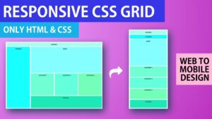
Creating Responsive Grid Layouts
One of the major advantages of using CSS Grid Layout is its ability to create responsive web layouts that adapt to different screen sizes and devices. With CSS Grid Layout, you can easily change the structure and design of a web page based on the available space.
To create responsive grid layouts, you can use media queries to target different screen sizes and apply different styles to the grid items. For example, you can change the number of columns or rows, adjust the size of grid items, or reposition them within the grid.
Media queries allow you to define CSS rules that will only be applied when certain conditions are met. These conditions can be based on the width and height of the viewport, the device orientation, or even the pixel density of the screen. By using media queries in combination with CSS Grid Layout, you can create a layout that responds to the user’s device and provides an optimal viewing experience.
For example, you can define a media query that targets devices with a maximum width of 768 pixels. Within this media query, you can specify that the grid should have a single column layout, with each item taking up the full width of the grid. This ensures that the content is displayed in a single column on smaller screens, making it easier to read and navigate.
On larger screens, you can define a media query that targets devices with a minimum width of 1024 pixels. Within this media query, you can specify that the grid should have a three-column layout, with each item taking up one-third of the grid’s width. This allows the content to be displayed in multiple columns, making use of the available space and improving the overall design.
By combining CSS Grid Layout with other CSS features, such as flexbox and CSS variables, you can create highly flexible and adaptive web layouts that provide a seamless user experience across different devices. Flexbox can be used to control the alignment and positioning of grid items within the grid, while CSS variables can be used to define reusable values that can be easily adjusted based on the screen size.
With the power of CSS Grid Layout and the flexibility of other CSS features, you have the tools to create responsive grid layouts that can adapt to any screen size or device. Whether you are designing a simple blog layout or a complex e-commerce website, CSS Grid Layout provides the flexibility and control you need to create a visually appealing and user-friendly web layout.